
Why Color Choice Matters
The colors used in your dining room set the tone for the entire experience. Warm tones can make meals feel more inviting and enjoyable. In Canadian homes where winters can be long and cold, a cozy color palette adds comfort and cheer.
Earthy Neutrals
Beige, taupe, and soft browns create a calm and grounded feel. These earthy shades pair well with wood furniture and natural decor elements. Use them as wall colors or in upholstery to build a warm, versatile foundation.
Rich Greens
Forest green and olive tones bring nature indoors. These hues complement wood, brass, and linen finishes, making them ideal for rustic or traditional Canadian interiors. Use green on an accent wall or in accessories to avoid overpowering the space.
Warm Terracotta and Rust
Terracotta, rust, and clay shades add depth and character to dining spaces. These colors offer a touch of vibrancy without being overwhelming. Pair them with cream or off-white for balance and softness.
Classic Navy with Warm Accents
Deep navy provides sophistication while maintaining a cozy atmosphere when paired with warm metallics or wood tones. This combination works beautifully in modern and transitional dining rooms across Canada.
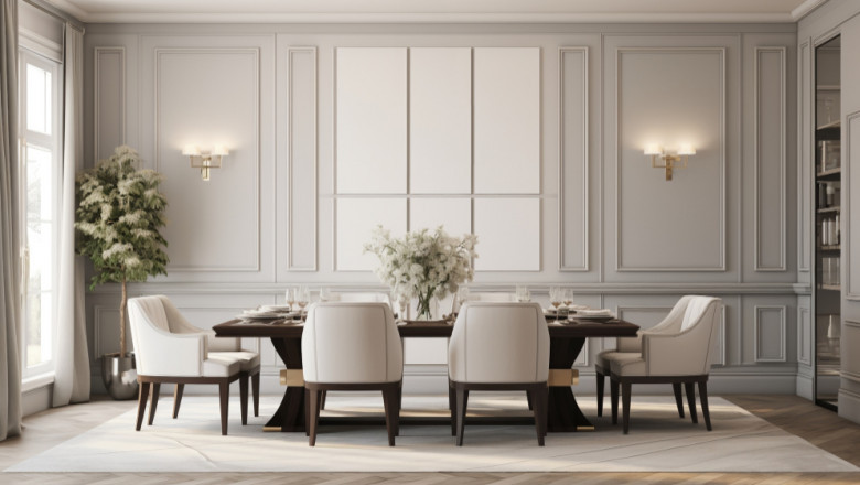
Soft Greys with Warm Undertones
Grey doesn’t have to feel cold. Choose greys with brown or pink undertones to add a sense of warmth. These subtle shades act as a neutral base that pairs well with bold artwork and statement furniture.
Mustard and Golden Yellows
Mustard and golden yellow tones bring energy and positivity to your dining area. These shades reflect light and make the room feel sunny, even in winter months. Combine them with muted colors to maintain a balanced look.
Blush and Dusty Rose
Soft pinks like blush or dusty rose create a gentle, welcoming environment. These shades work well with natural light and can be accented with brass, gold, or white for an elegant finish. Ideal for creating a soft, feminine charm.
Mixing and Layering Colors
Don’t limit your palette to one or two colors. Mix warm tones with neutral bases to add dimension. Use color through painted walls, textiles, and decorative accents. Canadian homes often benefit from layered textures and tones to fight off the dullness of long winters.
Consider Lighting and Room Size
Choosing the right color palette helps create a dining room that feels both stylish and welcoming. Whether your home is modern, rustic, or transitional, a warm color scheme enhances every meal and moment. For dining room pieces that match your perfect palette, browse the latest collections at Classico Roma.
Color perception changes with lighting. North-facing rooms may benefit from warmer colors to offset the cooler natural light. Smaller dining rooms look best in lighter tones to make them feel more spacious and airy.


Comments
0 comment