
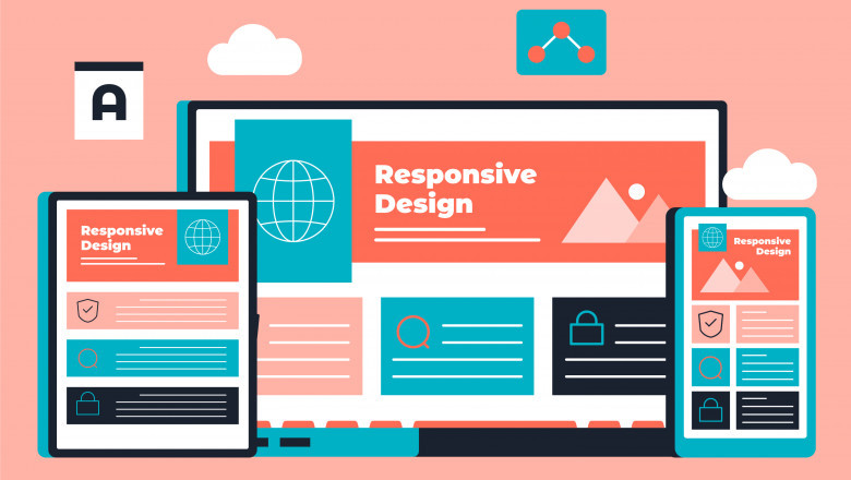
A responsive design ensures that your website looks and functions perfectly across all devices. With more users browsing on mobile devices, a non-responsive website can drive potential customers away. If you want to stay ahead of the competition, it’s time to transform your website with a responsive design.
Why Responsive Design Matters
When you visit a website on your phone, you can discover that the photos are too little, the text is too small, and you need to zoom in to navigate. This is why responsive design is essential. A well-optimized website adapts to different screen sizes, providing a seamless experience for users.
Here are some key reasons why responsive design is important:
- Enhanced User Experience: Visitors stay longer when they can easily navigate your website. A smooth experience increases engagement and reduces bounce rates.
- Better SEO Performance: Google prioritizes mobile-friendly websites in search rankings. A responsive design boosts your chances of appearing at the top.
- Faster Load Times: A responsive website is optimized for quick loading, improving user satisfaction.
- Higher Conversion Rates: When users have a positive experience, they are more likely to take action—whether it’s making a purchase, signing up, or contacting you.
- Future-Proofing Your Website: Technology is always evolving. A responsive design ensures your site remains compatible with new devices.
How to Make Your Website Responsive
Now that you understand the importance of responsive design, let’s talk about how you can transform your website.
1. Implement a Mobile-First Approach: Since mobile traffic has surpassed desktop usage, designing your website with mobile users in mind is crucial. A mobile-first approach ensures your site is fully optimized for smaller screens before scaling up to larger ones.
2. Use Flexible Grid Layouts: A responsive website should automatically adjust to different screen sizes. Using a flexible grid layout allows elements to resize proportionally, making the design fluid and adaptable.
3. Optimize Images and Media: Large images slow down websites, especially on mobile devices. Optimize images by compressing them without compromising quality. Use responsive images that adjust based on screen size for the best performance.
4. Improve Navigation: Simplify your website’s navigation so users can easily find what they need. Consider using a hamburger menu for mobile devices to keep things clean and organized.
5. Use Scalable Typography: Text should be readable on all devices. Avoid small fonts and use scalable typography that adjusts to different screen sizes for better readability.
6. Test Across Devices: Before launching, test your website on various devices and browsers to ensure consistency. Tools like Google’s Mobile-Friendly Test can help identify areas for improvement.
The Future of Responsive Web Design
Responsive design isn’t just a trend—it’s the future of web development. As new devices emerge, websites must be adaptable to stay relevant. Features like voice search optimization, AI-driven layouts, and interactive user experiences will shape the next phase of web design.
A well-designed website is your digital storefront and first impressions matter. At Global Key Info Solutions, we specialize in creating responsive websites that provide seamless user experiences and drive business growth. Our team is here to assist you with simple adjustments or a full transformation.


Comments
0 comment