
Why Mobile UX Matters: 7 Key Design Principles
Today, smartphones aren’t just a way to stay connected — they’re the primary way people search, shop, and do business online.
For many companies in India, more than 80% of their website traffic comes from mobile devices.
If your site isn’t designed with a mobile-first mindset, you’re losing potential customers, damaging your credibility, and hurting your bottom line.
A well-designed mobile UX (User Experience) makes it easy for people to navigate, find information quickly, and take action — whether that's making a phone call, booking a service, or adding a product to their shopping cart.
Here are 7 key design principles to keep in mind when designing your mobile UX — and why it matters.
1️ Prioritize Simplicity and Clarity
Less is more when designing for a little phone screen.
Remove needless distractions and focus on your main messages and calls to action.
Your menus should be clear, your content should be easy to read, and your transactions should be effortless.
Tip:
-
Stick to simple menus, clear fonts, and bold call-to-action (CTA) buttons.
2️ Touch-Friendly Buttons and Controls
Your users aren’t clicking with a mouse — they’re tapping with their fingertips.
Interactive features, menus, and buttons should all be big enough for a thumb to readily press.
Tip:
-
Interactive elements should ideally measure at least 44 pixels by 44 pixels.
3️ Fast Loading Speeds
Slow-loading sites suffer from higher abandonment rates, especially on mobile, where people may be on weak signals or less stable networks.
Tip:
-
Compress images.
-
Minimize heavy code.
-
Reduce server requests.
Your site should load within 2–3 seconds on a mobile phone.
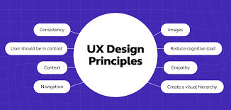
4️ Clear Visual Hierarchy
Design your content in a way that guides the user’s eyes to the most important elements first.
Use size, color, and contrast to highlight key messages — whether it's a special promotion or a Buy Now" button.
Tip:
-
Headings should be bold and large.
-
Buttons should contrast against the background.
5️ Responsive Layout and Fluid Grids
Your website should gracefully adapt to different phone sizes and orientations.
Using a fluid grid and flexible images ensures a consistent experience across smartphones, tablets, and other devices.
Tip:
-
Develop a mobile-first framework.
-
Handle different viewports gracefully.
6️ Accessible and Inclusive Design
Create with everyone in mind, including those with varying abilities.
This means adding alt text to images, proper color contrast, and clear, readable fonts.
Tip:
-
For body text, adhere to a minimum color contrast ratio of 4.5:1.
-
Provide descriptive alt text for images.
7️ Short, Sweet, and Actionable Content
Mobile screens can’t show large amounts of text at once.
Your content should be direct, clear, and actionable — helping users quickly find what they need and move forward in their journey.
Tip:
-
Split content into short segments.
-
Use clear headings, bullet points, and small paragraphs.
Why Mobile UX Should Be Your Top Priority
Designing for mobile first isn’t a nice-to-have — it’s a critical requirement.
Your website’s success depends on how easily people can use it on their smartphones.
Studies show nearly 79% of smartphones users made a purchase on their phone in the last 6 months.
If you ignore the mobile user experience, you're losing out on a significant portion of your potential market.
Why Web Era Solutions?
Our specialty at Web Era Solutions is creating cutting-edge, responsive, and conversion-oriented websites.
We put your customers first, making sure their journey from search to checkout is smooth and effortless — regardless of whether they’re using a phone, a laptop, or a desktop.
Our team comprises experienced designers and SEO experts who know exactly what it takes to create a mobile-friendly, SEO-optimized website that converts.
Book Us Today and Transform Your User Experience!
Don't let a bad mobile user experience turn off potential clients.
Allow Web Era Solutions to build a website that optimizes engagement, conversions, and loyalty by making a reservation with us today.